It’s easy to be a bit nostalgic for work pre-internet, when research could involve exploring the dusty confines of the British Library or the excitement of digging out an old tome from a government archive with numbers on Ugandan coffee exports from 1957. But nothing really beats the satisfaction available today from downloading in just three or four clicks the entire import-export database for the same country. Yet, it can be tempting to make Wikipedia or Google the default for research. So, here are some gems which make international development research better, easier and more productive.
1 | Economic atlas and the globe of economic complexity
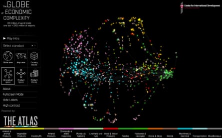
What’s it good for? If you like data visualisations and are interested in analysing trade flows and the sectoral composition of an economy, you can’t beat this website from Harvard. Cesar A. Hidalgo and Ricardo Hausmann have done some amazing work in the past few years conceptualising the enormous quantity of data on world trade to help us understand the processes of export diversification and industrialisation. This has developed further and the Atlas and Globe are probably the best visualisations of any dataset I’ve seen yet.
The cons: The product classifications can be difficult to understand, as can the product space concept.
2 | International Energy Agency atlas
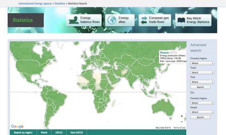
What’s it good for? To see how we are causing average CO2 levels to rise with the most consistent and accurate dataset available, see the Earth System Research Laboratory. But the real cause of climate change is obviously the emissions of fossil fuels either through industry, transportation, electricity production or indirectly via forest depletion. The IEA provides excellent data on how each country produces and consumes energy. Its energy statistics report is excellent, as is its energy atlas data tool. For energy statistics as well as projections up to 2035, the BP Energy Outlook is also very useful.
The cons: I’ve tried to calculate the CO2 implications of energy production and consumption figures in the past, but it is very difficult as the conversion factors used seem to vary from agency to agency. This is the best I’ve found.
3 | Transnational land database – the Land Matrix
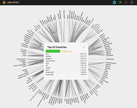
What’s it good for? International transactions in land have been called land grabs by some NGOs and the media. A meticulously developed database of international land transactions is available, called the Land Matrix, with plenty of useful visualisation tools.
The cons: The site admits itself the data is inherently unreliable. As I understand it this is because the information on such deals is often private and commercially sensitive.
4 | IMF data site, data mapper and IMF Article IV reports
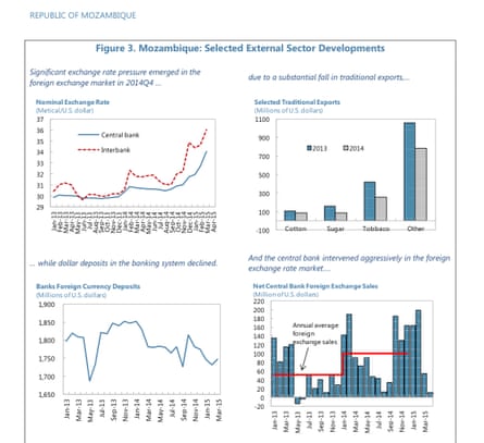
What’s it good for? The International Monetary Fund (IMF) Article IV reports are unbeatable as a free and up-to-date source of information on all major economic indicators for every country in the world; this includes debt and capital flows, as well as a treasure trove of qualitative information about the key developments, political and economic, from foreign direct investment (FDI) project progress to conflict and instability. The IMF World Economic Outlook data site and data mapper are very good as well, but if I’m researching any country I’ll always start with the Article IV report.
The cons: The annex tables within each report can sometimes be difficult to read and interpret, and it is not always apparent which statistics come directly from the government in question and how many are estimates made by the IMF. It is worth reading the small print. In particular, if you need FDI information it is worth comparing the IMF estimates with those provided by UNCTAD.
5 | The Armed Conflict Database maintained by Uppsala University
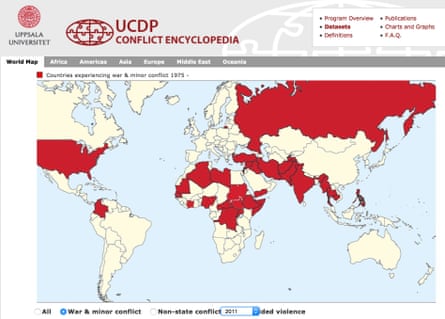
What’s it good for? If you are trying to analyse fragile and conflict-affected states as opposed to other countries, you need clear definitions of which countries fit in and when. The Uppsala Conflict Data Program (UCDP) has recorded ongoing violent conflicts since the 1970s, defining countries which had more than 25 battle deaths per year as experiencing minor conflicts and those with more than 1,000 as major conflicts. For fragility, try the World Bank’s Country Policy and Institutional Assessment (CPIA), a series of 16 measures on countries’ performance in implementing policies that promote economic growth and poverty reduction, where the World Bank classify a country as fragile if scoring 3.2 on the CPIA. You can also try the Fragile States Index, which is easier to use.
The cons: Conflict can be a highly contested term. In addition, the data does not distinguish terrorism as a separate category.
6 | World Bank Doing Business database
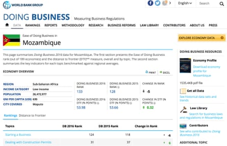
What’s it good for? I’ve found this an extremely useful and easy-to-use source of information on a broad range of business environment indicators, as well as excellent comparable data on the actual costs of trade. You do have to get into the sub-indicator information for it to be really useful though but the survey is annual so you can easily look for trends over time.
The cons: The Doing Business data collection process is often based on formal laws and procedures rather than those actually experienced by businesses in operation. As a result there is a case that it can be misleading on the true business environment – for example a formal process to start a business might take four days on paper but in reality would require a bribe to an official to be done in that timeframe. As a result I would also suggest using this data alongside Transparency International’s Corruption Perception index, which gives a measure of corruption based on surveys with real businesses and investors.
7 | The World Bank’s World Development Indicators
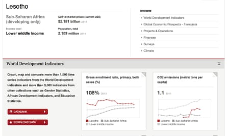
What’s it good for? Absolutely everything. The World Development Indicators (WDI) is a huge collection of national data on hundreds of indicators, from the number of mobile phones per 1,000 people to the number of children out of school. It goes back a long way and has data on every country in the world.
The cons: As well as being prone to crash Microsoft Excel at 84MB for the full sheet, the database is a collation of a huge range of sources. It is important to understand the real source when evaluating the quality and consistency of the data used, but unfortunately the dataset itself is not clearly labelled so you don’t know the source for a lot of the information. You are also liable to drown a bit in the quantity here. So, if I was after agricultural data I would actually go first to the UN’s Food and Agricultural Organisation (FAO), for education data Unesco’s Global Education Digest and for economic indicators I’d probably start with the IMF’s World Economic Outlook.
8 | UNDP’s Human Development Index (HDI)
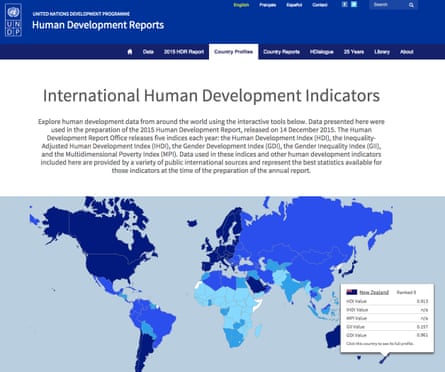
What’s it good for? If you want a holistic ranking of progress of a country on human development, the HDI still provides a good benchmark. It brings together gross national income (GNI) per capita with life expectancy, and high-level education indicators, into a useful index for international comparisons. But the dataset behind the high-level index is much more detailed, including information from the HIV prevalence rates to primary school drop-out rates.
The cons: The HDI draws on a range of other sources. Read the small print.
9 | UN COMTRADE database
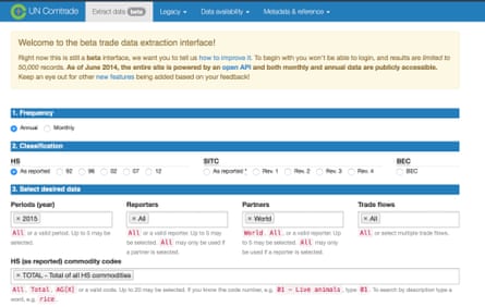
What’s it good for? For raw data on high-level trade, I would go to COMTRADE. They do visualisations but you can also download large amounts of data, although for this you need to know the commodity codes you are interested in. However, if you can get yourself a login for the World Bank’s World Integrated Trade Solution (WITS), do so, it’s by far the easiest way to search COMTRADE data.
The cons: There are a few different categories used for classifying product types. I would always use SITC ver.3, which I’ve found has the largest amount of data available and it is easier to analyse. As you can go right down to very fine product categories, you need to know what level of detail you are interested in, otherwise you can end up with an unmanageable amount of information.
10 | OECD aid database
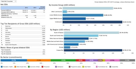
What’s it good for? If you are doing any analysis in which aid itself is a key variable, then there is no better source than the OECD aid database. It is the only really consistent data source on aid I’ve seen.
The cons: The aid data is collected from governments, which may have different definitions both of Official Development Assistance (ODA) and of what constitutes sectoral focus – I’ve found it particularly difficult to classify how much money is given to private sector development interventions, for example. In addition the split between budget support and sector programmes is not always clearly specified. It is useful to cross-check the figures with the IMF Article IV balance of payments stats if you can.
- This article was amended on 23 March 2016. An earlier version said that the Armed Conflict Database is maintained by the International Peace Research Institute of Oslo and Uppsala University. All the data on this webpage is actually solely maintained by Uppsala University.
What websites do you go to for your international development data? Share your favourites in the comments below.
Joseph Holden is a consultant in international development specialising in monitoring and evaluation for Foresight Development Associates. This is an extract of a longer article was previously published here.
Join our community of development professionals and humanitarians. Follow@GuardianGDP on Twitter.

Comments (…)
Sign in or create your Guardian account to join the discussion